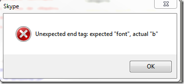
Message to users should be useful
There are a lot of rules for usability of User Interface, and one of the most important one is not to clutter the user with strange error messages. Since the last update of skype, sometimes when I’m chatting with someone a really useful message box appears.
This windows does not communicate nothing to the user, moreover if you click ok nothing happens… skype continue to work with no problem. This design violates some best practice of the UI.
- It shows a completely unnecessary and obscure message to the user
- It presents only the Ok button, so the user cannot choose any options. A Modal dialog box should be used when the user need to choose an option.
- It shows a Red Cross, but the program works perfectly after this error.
- This messagebox popup in front of every windows, distracting the user and adding no value to UI.
Such a message would be better handled in this way.
- Since the program can continue to work after this event, log this information in a logfile, and maybe use a little “communication box* in the interface, instead of a modal messagebox with only an option.
- Send a logfile to the team, if this is an error, the development team can handle it an find a bug, the user does not need to see what is happened behind the curtain.
alk.

