Balsamiq mockup to the rescue
Today I have to add some features to a wpf application and the interface was already quite cluttered with controls. Things are becoming messy, so I decided that I need to spent a little time restructuring the UI. I decided to use collapsible panels, but I need users feelings about this change, so I open balsamiq and created some mockup.
The good stuff about balsamiq is that is incredible simple to use and really versatile, first of all I noticed that there are no collapsible panel control but it is simple to simulate one, first of all you can create a rectangle
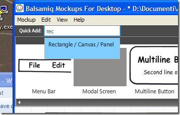
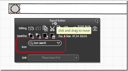
One of the most useful features of balsamiq is that Ican quickly type a few letter in the quick add textbox and immediately find the object I need. I add a canvas, a round button, and finally I choose an icon for the button
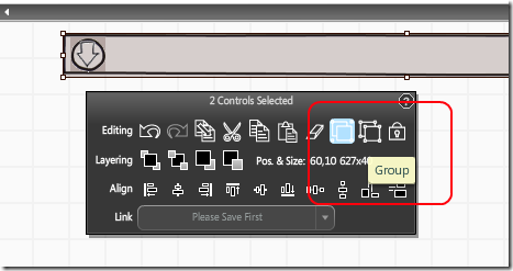
Then I simply group the two object together and I have a good approximation of what a collapsible panel would appear on my UI.
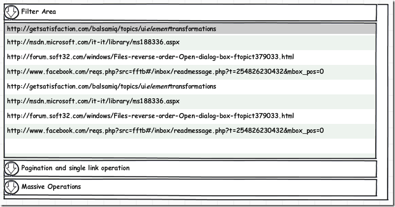
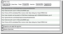
Now I’m able to redraw the part of the interface I need to redesign, first of all I show how the interface will appear when it is first opened, when all the collapsible panels are collapsed.
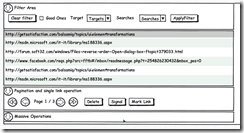
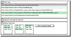
With few clicks and no more than a minute of work I was able to create a really good representation of the new interface, then in another few minutes I created the mockup of the interface when the panel are expanded
In less than five minutes I have a good feeling of how I intended to reorganize the interface (Actually all controls are messed up under the main grid :) ), the most important stuff is that users can open the mockup and move controls around if they do not like my arrangement. Thanks to balsamiq this operation was done quickly and with great result, after few minutes I was able to actually modify the interface with confidence because I already know that users had already validated it.
Alk.
Tags: Balsamiq

